Onboarding modals
5-step guided tour that fires on first sign-in: shared dark shell, per-step illustration + headline.
How this page works: every step card is self-contained. The card renders the live componentized modal (real .pop-modal* classes, illustration is the only PNG) and its drawer carries the complete handoff — component badges, the full <OnboardingModal> Vue source, this step's parent invocation, all wrapper + 🟡 atom CSS, and behavior notes. step (slug) drives the headline, illustration, active pagination dot, and CTA labels.
Steps
5 steps · same shellAction bar

Gather your selected emojis here to save them to a list or build combos of up to 8.
<PopModal> · ui/components/pop/PopModal.vue<PrimaryButton> · ui/buttons/PrimaryButton.vue<Text> · ui/components/Text.vue<OnboardingModal> — new wrapper (Vue below)<PopModalEyebrow> · catalog — CSS below<Stepper> · catalog — CSS below.pop-modal__illustration — new CSS (in the CSS pane below)<script setup>
import { computed } from 'vue'
import PopModal from '@/components/pop/PopModal.vue'
import PopModalEyebrow from '@/components/pop/PopModalEyebrow.vue'
import Stepper from '@/components/Stepper.vue'
import PrimaryButton from '@/buttons/PrimaryButton.vue'
import Text from '@/components/Text.vue'
const props = defineProps({
show: Boolean,
step: { type: String, required: true }, // slug — see STEPS map
})
const emit = defineEmits([
'update:show', 'update:step',
'next', 'back', 'skip', 'get-started',
]);
// Single source of truth — keep in sync with onboarding telemetry events.
// `illoCard` controls whether the inner illustration sits inside a white card
// (steps 2-5) or floats bare on the dark modal bg (step 1, the action-bar).
const STEPS = [
{ n: 1, slug: 'action-bar', title: 'Action bar', primary: 'Next', secondary: 'Skip', illoFile: '1-action-bar.png', illoCard: false, desc: 'Gather your selected emojis here to save them to a list or build combos of up to 8.' },
{ n: 2, slug: 'add-to-favorites', title: 'Add to Favorites', primary: 'Next', secondary: 'Back', illoFile: '2-add-to-favorites.png', illoCard: true, desc: 'Keep your go-to emojis one click away by saving them to a list or combo.' },
{ n: 3, slug: 'my-emoji-page', title: 'My Emoji Page', primary: 'Next', secondary: 'Back', illoFile: '3-my-emoji-page.png', illoCard: true, desc: 'Keep and manage all your custom lists, and saved collections, in one place.' },
{ n: 4, slug: 'all-emoji-page', title: 'All Emoji Page', primary: 'Next', secondary: 'Back', illoFile: '4-all-emoji-page.png', illoCard: true, desc: 'Explore the complete collection and pick the perfect emojis to save.' },
{ n: 5, slug: 'explore-page', title: 'Explore Page', primary: 'Get Started', secondary: 'Back', illoFile: '5-explore-page.png', illoCard: true, desc: 'Find new inspiration by browsing curated lists from other users and our team.' },
];
const index = computed(() => STEPS.findIndex(s => s.slug === props.step))
const config = computed(() => STEPS[index.value])
const isLast = computed(() => index.value === STEPS.length - 1)
const isFirst= computed(() => index.value === 0)
const illoSrc= computed(() => `/assets/onboarding/illustrations/${config.value.illoFile}`)
function onPrimary() {
if (isLast.value) {
emit('get-started');
emit('update:show', false);
} else {
emit('next');
emit('update:step', STEPS[index.value + 1].slug);
}
}
function onSecondary() {
if (isFirst.value) {
emit('skip');
emit('update:show', false);
} else {
emit('back');
emit('update:step', STEPS[index.value - 1].slug);
}
}
</script>
<template>
<PopModal :popped="show" width="540px"
@unpop="emit('update:show', false)">
<div class="pop-modal onboarding-modal">
<button class="pop-modal__close"
aria-label="Close"
@click="emit('update:show', false)">×</button>
<PopModalEyebrow>The new Emojicopy</PopModalEyebrow>
<Text tag="h3" class="pop-modal__title" :text="config.title" />
<div class="pop-modal__content">
<div class="pop-modal__illustration"
:class="{ 'pop-modal__illustration--card': config.illoCard }">
<img :src="illoSrc" :alt="`${config.title} illustration`" />
</div>
</div>
<Stepper :total="STEPS.length" :model-value="index" />
<p class="pop-modal__description">{{ config.desc }}</p>
<div class="pop-modal__footer">
<PrimaryButton variant="gray" size="lg"
:label="config.secondary"
@click="onSecondary" />
<PrimaryButton variant="green" size="lg"
:label="config.primary"
@click="onPrimary" />
</div>
</div>
</PopModal>
</template>
<OnboardingModal :show="modals.onboarding" step="action-bar"
                 @next="goNext"
                 @skip="dismissOnboarding" />
<Stepper> and <PopModalEyebrow>
/* OnboardingModal.vue <style scoped> — wrapper composition.
   Everything below is NOT in the app yet; the ✅ source components
   (<PopModal>, <PrimaryButton>, <Text>) need nothing. */

/* Inner illustration container — the white card holding an app screenshot
   for an onboarding step. Has 16-24px breathing room, rounded corners,
   subtle inner shadow. The image inside fills the card. */
.pop-modal__illustration {
    width: 100%;
    display: flex;
    align-items: center;
    justify-content: center;

    img {
        display: block;
        width: 100%;
        height: auto;
        max-width: 100%;
        border-radius: var(--r-md);
    }
}

/* Card variant — wraps the image in a white card. Drop the --card modifier
   when the illustration is a bare component on the dark modal bg (e.g. the
   action-bar step 1). Flat selector on purpose — native CSS nesting does
   not support BEM concatenation like `&--card`. */
.pop-modal__illustration--card {
    padding: 10px;
    background: var(--white);
    border-radius: var(--r-lg);
    box-shadow: inset 0 0 0 1px color-mix(in srgb, var(--metal-300) 30%, transparent);
}

/* Stepper.vue <style scoped> — 🟡 new atom (pagination dots).
   When the app ships <Stepper>, this CSS migrates into its scoped block. */
.pop-modal__stepper {
    display: flex;
    align-items: center;
    justify-content: center;
    gap: 8px;
    padding: 2px 0;
}

.pop-modal__stepper-dot {
    width: 8px;
    height: 8px;
    border-radius: 50%;
    background: color-mix(in srgb, var(--white) 25%, transparent);
    transition: background .15s, box-shadow .2s;
}

.pop-modal__stepper-dot.is-active {
    background: var(--white);
    box-shadow: 0 0 0 4px color-mix(in srgb, var(--white) 12%, transparent);
}

/* PopModalEyebrow.vue <style scoped> — 🟡 new atom (translucent
   eyebrow pill on the dark shell). */
.pop-modal__eyebrow {
    display: inline-flex;
    align-items: center;
    gap: 8px;
    padding: 6px 14px 6px 12px;
    border-radius: var(--r-pill);
    background: color-mix(in srgb, var(--metal-300) 12%, transparent);
    box-shadow: inset 0 0 0 1px color-mix(in srgb, var(--metal-300) 14%, transparent);
    font-family: var(--ff-inter);
    font-weight: 700;
    font-size: 1.3rem;
    line-height: 1.4;
    color: var(--white);
}

.pop-modal__eyebrow-dot {
    width: 10px; height: 10px;
    border-radius: 50%;
    background: var(--green-600);
    flex: none;
}
Add to Favorites
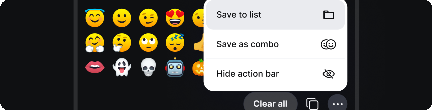
Keep your go-to emojis one click away by saving them to a list or combo.
<PopModal> · ui/components/pop/PopModal.vue<PrimaryButton> · ui/buttons/PrimaryButton.vue<Text> · ui/components/Text.vue<OnboardingModal> — new wrapper (Vue below)<PopModalEyebrow> · catalog — CSS below<Stepper> · catalog — CSS below.pop-modal__illustration — new CSS (in the CSS pane below)<script setup>
import { computed } from 'vue'
import PopModal from '@/components/pop/PopModal.vue'
import PopModalEyebrow from '@/components/pop/PopModalEyebrow.vue'
import Stepper from '@/components/Stepper.vue'
import PrimaryButton from '@/buttons/PrimaryButton.vue'
import Text from '@/components/Text.vue'
const props = defineProps({
show: Boolean,
step: { type: String, required: true }, // slug — see STEPS map
})
const emit = defineEmits([
'update:show', 'update:step',
'next', 'back', 'skip', 'get-started',
]);
// Single source of truth — keep in sync with onboarding telemetry events.
// `illoCard` controls whether the inner illustration sits inside a white card
// (steps 2-5) or floats bare on the dark modal bg (step 1, the action-bar).
const STEPS = [
{ n: 1, slug: 'action-bar', title: 'Action bar', primary: 'Next', secondary: 'Skip', illoFile: '1-action-bar.png', illoCard: false, desc: 'Gather your selected emojis here to save them to a list or build combos of up to 8.' },
{ n: 2, slug: 'add-to-favorites', title: 'Add to Favorites', primary: 'Next', secondary: 'Back', illoFile: '2-add-to-favorites.png', illoCard: true, desc: 'Keep your go-to emojis one click away by saving them to a list or combo.' },
{ n: 3, slug: 'my-emoji-page', title: 'My Emoji Page', primary: 'Next', secondary: 'Back', illoFile: '3-my-emoji-page.png', illoCard: true, desc: 'Keep and manage all your custom lists, and saved collections, in one place.' },
{ n: 4, slug: 'all-emoji-page', title: 'All Emoji Page', primary: 'Next', secondary: 'Back', illoFile: '4-all-emoji-page.png', illoCard: true, desc: 'Explore the complete collection and pick the perfect emojis to save.' },
{ n: 5, slug: 'explore-page', title: 'Explore Page', primary: 'Get Started', secondary: 'Back', illoFile: '5-explore-page.png', illoCard: true, desc: 'Find new inspiration by browsing curated lists from other users and our team.' },
];
const index = computed(() => STEPS.findIndex(s => s.slug === props.step))
const config = computed(() => STEPS[index.value])
const isLast = computed(() => index.value === STEPS.length - 1)
const isFirst= computed(() => index.value === 0)
const illoSrc= computed(() => `/assets/onboarding/illustrations/${config.value.illoFile}`)
function onPrimary() {
if (isLast.value) {
emit('get-started');
emit('update:show', false);
} else {
emit('next');
emit('update:step', STEPS[index.value + 1].slug);
}
}
function onSecondary() {
if (isFirst.value) {
emit('skip');
emit('update:show', false);
} else {
emit('back');
emit('update:step', STEPS[index.value - 1].slug);
}
}
</script>
<template>
<PopModal :popped="show" width="540px"
@unpop="emit('update:show', false)">
<div class="pop-modal onboarding-modal">
<button class="pop-modal__close"
aria-label="Close"
@click="emit('update:show', false)">×</button>
<PopModalEyebrow>The new Emojicopy</PopModalEyebrow>
<Text tag="h3" class="pop-modal__title" :text="config.title" />
<div class="pop-modal__content">
<div class="pop-modal__illustration"
:class="{ 'pop-modal__illustration--card': config.illoCard }">
<img :src="illoSrc" :alt="`${config.title} illustration`" />
</div>
</div>
<Stepper :total="STEPS.length" :model-value="index" />
<p class="pop-modal__description">{{ config.desc }}</p>
<div class="pop-modal__footer">
<PrimaryButton variant="gray" size="lg"
:label="config.secondary"
@click="onSecondary" />
<PrimaryButton variant="green" size="lg"
:label="config.primary"
@click="onPrimary" />
</div>
</div>
</PopModal>
</template>
<OnboardingModal :show="modals.onboarding" step="add-to-favorites"
                 @next="goNext"
                 @back="goBack" />
<Stepper> and <PopModalEyebrow>
/* OnboardingModal.vue <style scoped> — wrapper composition.
   Everything below is NOT in the app yet; the ✅ source components
   (<PopModal>, <PrimaryButton>, <Text>) need nothing. */

/* Inner illustration container — the white card holding an app screenshot
   for an onboarding step. Has 16-24px breathing room, rounded corners,
   subtle inner shadow. The image inside fills the card. */
.pop-modal__illustration {
    width: 100%;
    display: flex;
    align-items: center;
    justify-content: center;

    img {
        display: block;
        width: 100%;
        height: auto;
        max-width: 100%;
        border-radius: var(--r-md);
    }
}

/* Card variant — wraps the image in a white card. Drop the --card modifier
   when the illustration is a bare component on the dark modal bg (e.g. the
   action-bar step 1). Flat selector on purpose — native CSS nesting does
   not support BEM concatenation like `&--card`. */
.pop-modal__illustration--card {
    padding: 10px;
    background: var(--white);
    border-radius: var(--r-lg);
    box-shadow: inset 0 0 0 1px color-mix(in srgb, var(--metal-300) 30%, transparent);
}

/* Stepper.vue <style scoped> — 🟡 new atom (pagination dots).
   When the app ships <Stepper>, this CSS migrates into its scoped block. */
.pop-modal__stepper {
    display: flex;
    align-items: center;
    justify-content: center;
    gap: 8px;
    padding: 2px 0;
}

.pop-modal__stepper-dot {
    width: 8px;
    height: 8px;
    border-radius: 50%;
    background: color-mix(in srgb, var(--white) 25%, transparent);
    transition: background .15s, box-shadow .2s;
}

.pop-modal__stepper-dot.is-active {
    background: var(--white);
    box-shadow: 0 0 0 4px color-mix(in srgb, var(--white) 12%, transparent);
}

/* PopModalEyebrow.vue <style scoped> — 🟡 new atom (translucent
   eyebrow pill on the dark shell). */
.pop-modal__eyebrow {
    display: inline-flex;
    align-items: center;
    gap: 8px;
    padding: 6px 14px 6px 12px;
    border-radius: var(--r-pill);
    background: color-mix(in srgb, var(--metal-300) 12%, transparent);
    box-shadow: inset 0 0 0 1px color-mix(in srgb, var(--metal-300) 14%, transparent);
    font-family: var(--ff-inter);
    font-weight: 700;
    font-size: 1.3rem;
    line-height: 1.4;
    color: var(--white);
}

.pop-modal__eyebrow-dot {
    width: 10px; height: 10px;
    border-radius: 50%;
    background: var(--green-600);
    flex: none;
}
My Emoji Page
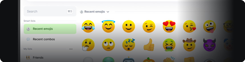
Keep and manage all your custom lists, and saved collections, in one place.
<PopModal> · ui/components/pop/PopModal.vue<PrimaryButton> · ui/buttons/PrimaryButton.vue<Text> · ui/components/Text.vue<OnboardingModal> — new wrapper (Vue below)<PopModalEyebrow> · catalog — CSS below<Stepper> · catalog — CSS below.pop-modal__illustration — new CSS (in the CSS pane below)<script setup>
import { computed } from 'vue'
import PopModal from '@/components/pop/PopModal.vue'
import PopModalEyebrow from '@/components/pop/PopModalEyebrow.vue'
import Stepper from '@/components/Stepper.vue'
import PrimaryButton from '@/buttons/PrimaryButton.vue'
import Text from '@/components/Text.vue'
const props = defineProps({
show: Boolean,
step: { type: String, required: true }, // slug — see STEPS map
})
const emit = defineEmits([
'update:show', 'update:step',
'next', 'back', 'skip', 'get-started',
]);
// Single source of truth — keep in sync with onboarding telemetry events.
// `illoCard` controls whether the inner illustration sits inside a white card
// (steps 2-5) or floats bare on the dark modal bg (step 1, the action-bar).
const STEPS = [
{ n: 1, slug: 'action-bar', title: 'Action bar', primary: 'Next', secondary: 'Skip', illoFile: '1-action-bar.png', illoCard: false, desc: 'Gather your selected emojis here to save them to a list or build combos of up to 8.' },
{ n: 2, slug: 'add-to-favorites', title: 'Add to Favorites', primary: 'Next', secondary: 'Back', illoFile: '2-add-to-favorites.png', illoCard: true, desc: 'Keep your go-to emojis one click away by saving them to a list or combo.' },
{ n: 3, slug: 'my-emoji-page', title: 'My Emoji Page', primary: 'Next', secondary: 'Back', illoFile: '3-my-emoji-page.png', illoCard: true, desc: 'Keep and manage all your custom lists, and saved collections, in one place.' },
{ n: 4, slug: 'all-emoji-page', title: 'All Emoji Page', primary: 'Next', secondary: 'Back', illoFile: '4-all-emoji-page.png', illoCard: true, desc: 'Explore the complete collection and pick the perfect emojis to save.' },
{ n: 5, slug: 'explore-page', title: 'Explore Page', primary: 'Get Started', secondary: 'Back', illoFile: '5-explore-page.png', illoCard: true, desc: 'Find new inspiration by browsing curated lists from other users and our team.' },
];
const index = computed(() => STEPS.findIndex(s => s.slug === props.step))
const config = computed(() => STEPS[index.value])
const isLast = computed(() => index.value === STEPS.length - 1)
const isFirst= computed(() => index.value === 0)
const illoSrc= computed(() => `/assets/onboarding/illustrations/${config.value.illoFile}`)
function onPrimary() {
if (isLast.value) {
emit('get-started');
emit('update:show', false);
} else {
emit('next');
emit('update:step', STEPS[index.value + 1].slug);
}
}
function onSecondary() {
if (isFirst.value) {
emit('skip');
emit('update:show', false);
} else {
emit('back');
emit('update:step', STEPS[index.value - 1].slug);
}
}
</script>
<template>
<PopModal :popped="show" width="540px"
@unpop="emit('update:show', false)">
<div class="pop-modal onboarding-modal">
<button class="pop-modal__close"
aria-label="Close"
@click="emit('update:show', false)">×</button>
<PopModalEyebrow>The new Emojicopy</PopModalEyebrow>
<Text tag="h3" class="pop-modal__title" :text="config.title" />
<div class="pop-modal__content">
<div class="pop-modal__illustration"
:class="{ 'pop-modal__illustration--card': config.illoCard }">
<img :src="illoSrc" :alt="`${config.title} illustration`" />
</div>
</div>
<Stepper :total="STEPS.length" :model-value="index" />
<p class="pop-modal__description">{{ config.desc }}</p>
<div class="pop-modal__footer">
<PrimaryButton variant="gray" size="lg"
:label="config.secondary"
@click="onSecondary" />
<PrimaryButton variant="green" size="lg"
:label="config.primary"
@click="onPrimary" />
</div>
</div>
</PopModal>
</template>
<OnboardingModal :show="modals.onboarding" step="my-emoji-page"
                 @next="goNext"
                 @back="goBack" />
<Stepper> and <PopModalEyebrow>
/* OnboardingModal.vue <style scoped> — wrapper composition.
   Everything below is NOT in the app yet; the ✅ source components
   (<PopModal>, <PrimaryButton>, <Text>) need nothing. */

/* Inner illustration container — the white card holding an app screenshot
   for an onboarding step. Has 16-24px breathing room, rounded corners,
   subtle inner shadow. The image inside fills the card. */
.pop-modal__illustration {
    width: 100%;
    display: flex;
    align-items: center;
    justify-content: center;

    img {
        display: block;
        width: 100%;
        height: auto;
        max-width: 100%;
        border-radius: var(--r-md);
    }
}

/* Card variant — wraps the image in a white card. Drop the --card modifier
   when the illustration is a bare component on the dark modal bg (e.g. the
   action-bar step 1). Flat selector on purpose — native CSS nesting does
   not support BEM concatenation like `&--card`. */
.pop-modal__illustration--card {
    padding: 10px;
    background: var(--white);
    border-radius: var(--r-lg);
    box-shadow: inset 0 0 0 1px color-mix(in srgb, var(--metal-300) 30%, transparent);
}

/* Stepper.vue <style scoped> — 🟡 new atom (pagination dots).
   When the app ships <Stepper>, this CSS migrates into its scoped block. */
.pop-modal__stepper {
    display: flex;
    align-items: center;
    justify-content: center;
    gap: 8px;
    padding: 2px 0;
}

.pop-modal__stepper-dot {
    width: 8px;
    height: 8px;
    border-radius: 50%;
    background: color-mix(in srgb, var(--white) 25%, transparent);
    transition: background .15s, box-shadow .2s;
}

.pop-modal__stepper-dot.is-active {
    background: var(--white);
    box-shadow: 0 0 0 4px color-mix(in srgb, var(--white) 12%, transparent);
}

/* PopModalEyebrow.vue <style scoped> — 🟡 new atom (translucent
   eyebrow pill on the dark shell). */
.pop-modal__eyebrow {
    display: inline-flex;
    align-items: center;
    gap: 8px;
    padding: 6px 14px 6px 12px;
    border-radius: var(--r-pill);
    background: color-mix(in srgb, var(--metal-300) 12%, transparent);
    box-shadow: inset 0 0 0 1px color-mix(in srgb, var(--metal-300) 14%, transparent);
    font-family: var(--ff-inter);
    font-weight: 700;
    font-size: 1.3rem;
    line-height: 1.4;
    color: var(--white);
}

.pop-modal__eyebrow-dot {
    width: 10px; height: 10px;
    border-radius: 50%;
    background: var(--green-600);
    flex: none;
}
All Emoji Page
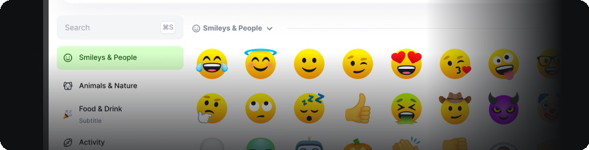
Explore the complete collection and pick the perfect emojis to save.
<PopModal> · ui/components/pop/PopModal.vue<PrimaryButton> · ui/buttons/PrimaryButton.vue<Text> · ui/components/Text.vue<OnboardingModal> — new wrapper (Vue below)<PopModalEyebrow> · catalog — CSS below<Stepper> · catalog — CSS below.pop-modal__illustration — new CSS (in the CSS pane below)<script setup>
import { computed } from 'vue'
import PopModal from '@/components/pop/PopModal.vue'
import PopModalEyebrow from '@/components/pop/PopModalEyebrow.vue'
import Stepper from '@/components/Stepper.vue'
import PrimaryButton from '@/buttons/PrimaryButton.vue'
import Text from '@/components/Text.vue'
const props = defineProps({
show: Boolean,
step: { type: String, required: true }, // slug — see STEPS map
})
const emit = defineEmits([
'update:show', 'update:step',
'next', 'back', 'skip', 'get-started',
]);
// Single source of truth — keep in sync with onboarding telemetry events.
// `illoCard` controls whether the inner illustration sits inside a white card
// (steps 2-5) or floats bare on the dark modal bg (step 1, the action-bar).
const STEPS = [
{ n: 1, slug: 'action-bar', title: 'Action bar', primary: 'Next', secondary: 'Skip', illoFile: '1-action-bar.png', illoCard: false, desc: 'Gather your selected emojis here to save them to a list or build combos of up to 8.' },
{ n: 2, slug: 'add-to-favorites', title: 'Add to Favorites', primary: 'Next', secondary: 'Back', illoFile: '2-add-to-favorites.png', illoCard: true, desc: 'Keep your go-to emojis one click away by saving them to a list or combo.' },
{ n: 3, slug: 'my-emoji-page', title: 'My Emoji Page', primary: 'Next', secondary: 'Back', illoFile: '3-my-emoji-page.png', illoCard: true, desc: 'Keep and manage all your custom lists, and saved collections, in one place.' },
{ n: 4, slug: 'all-emoji-page', title: 'All Emoji Page', primary: 'Next', secondary: 'Back', illoFile: '4-all-emoji-page.png', illoCard: true, desc: 'Explore the complete collection and pick the perfect emojis to save.' },
{ n: 5, slug: 'explore-page', title: 'Explore Page', primary: 'Get Started', secondary: 'Back', illoFile: '5-explore-page.png', illoCard: true, desc: 'Find new inspiration by browsing curated lists from other users and our team.' },
];
const index = computed(() => STEPS.findIndex(s => s.slug === props.step))
const config = computed(() => STEPS[index.value])
const isLast = computed(() => index.value === STEPS.length - 1)
const isFirst= computed(() => index.value === 0)
const illoSrc= computed(() => `/assets/onboarding/illustrations/${config.value.illoFile}`)
function onPrimary() {
if (isLast.value) {
emit('get-started');
emit('update:show', false);
} else {
emit('next');
emit('update:step', STEPS[index.value + 1].slug);
}
}
function onSecondary() {
if (isFirst.value) {
emit('skip');
emit('update:show', false);
} else {
emit('back');
emit('update:step', STEPS[index.value - 1].slug);
}
}
</script>
<template>
<PopModal :popped="show" width="540px"
@unpop="emit('update:show', false)">
<div class="pop-modal onboarding-modal">
<button class="pop-modal__close"
aria-label="Close"
@click="emit('update:show', false)">×</button>
<PopModalEyebrow>The new Emojicopy</PopModalEyebrow>
<Text tag="h3" class="pop-modal__title" :text="config.title" />
<div class="pop-modal__content">
<div class="pop-modal__illustration"
:class="{ 'pop-modal__illustration--card': config.illoCard }">
<img :src="illoSrc" :alt="`${config.title} illustration`" />
</div>
</div>
<Stepper :total="STEPS.length" :model-value="index" />
<p class="pop-modal__description">{{ config.desc }}</p>
<div class="pop-modal__footer">
<PrimaryButton variant="gray" size="lg"
:label="config.secondary"
@click="onSecondary" />
<PrimaryButton variant="green" size="lg"
:label="config.primary"
@click="onPrimary" />
</div>
</div>
</PopModal>
</template>
<OnboardingModal :show="modals.onboarding" step="all-emoji-page"
                 @next="goNext"
                 @back="goBack" />
<Stepper> and <PopModalEyebrow>
/* OnboardingModal.vue <style scoped> — wrapper composition.
   Everything below is NOT in the app yet; the ✅ source components
   (<PopModal>, <PrimaryButton>, <Text>) need nothing. */

/* Inner illustration container — the white card holding an app screenshot
   for an onboarding step. Has 16-24px breathing room, rounded corners,
   subtle inner shadow. The image inside fills the card. */
.pop-modal__illustration {
    width: 100%;
    display: flex;
    align-items: center;
    justify-content: center;

    img {
        display: block;
        width: 100%;
        height: auto;
        max-width: 100%;
        border-radius: var(--r-md);
    }
}

/* Card variant — wraps the image in a white card. Drop the --card modifier
   when the illustration is a bare component on the dark modal bg (e.g. the
   action-bar step 1). Flat selector on purpose — native CSS nesting does
   not support BEM concatenation like `&--card`. */
.pop-modal__illustration--card {
    padding: 10px;
    background: var(--white);
    border-radius: var(--r-lg);
    box-shadow: inset 0 0 0 1px color-mix(in srgb, var(--metal-300) 30%, transparent);
}

/* Stepper.vue <style scoped> — 🟡 new atom (pagination dots).
   When the app ships <Stepper>, this CSS migrates into its scoped block. */
.pop-modal__stepper {
    display: flex;
    align-items: center;
    justify-content: center;
    gap: 8px;
    padding: 2px 0;
}

.pop-modal__stepper-dot {
    width: 8px;
    height: 8px;
    border-radius: 50%;
    background: color-mix(in srgb, var(--white) 25%, transparent);
    transition: background .15s, box-shadow .2s;
}

.pop-modal__stepper-dot.is-active {
    background: var(--white);
    box-shadow: 0 0 0 4px color-mix(in srgb, var(--white) 12%, transparent);
}

/* PopModalEyebrow.vue <style scoped> — 🟡 new atom (translucent
   eyebrow pill on the dark shell). */
.pop-modal__eyebrow {
    display: inline-flex;
    align-items: center;
    gap: 8px;
    padding: 6px 14px 6px 12px;
    border-radius: var(--r-pill);
    background: color-mix(in srgb, var(--metal-300) 12%, transparent);
    box-shadow: inset 0 0 0 1px color-mix(in srgb, var(--metal-300) 14%, transparent);
    font-family: var(--ff-inter);
    font-weight: 700;
    font-size: 1.3rem;
    line-height: 1.4;
    color: var(--white);
}

.pop-modal__eyebrow-dot {
    width: 10px; height: 10px;
    border-radius: 50%;
    background: var(--green-600);
    flex: none;
}
Explore Page
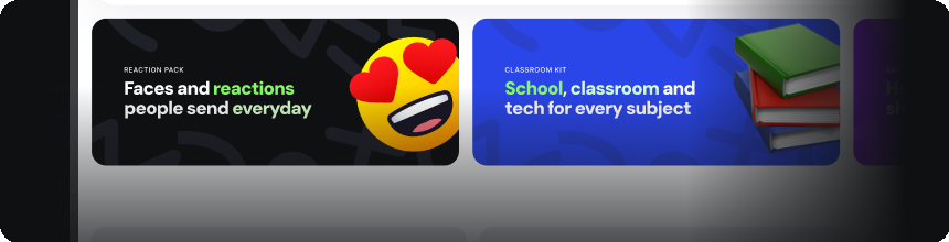
Find new inspiration by browsing curated lists from other users and our team.
<PopModal> · ui/components/pop/PopModal.vue<PrimaryButton> · ui/buttons/PrimaryButton.vue<Text> · ui/components/Text.vue<OnboardingModal> — new wrapper (Vue below)<PopModalEyebrow> · catalog — CSS below<Stepper> · catalog — CSS below.pop-modal__illustration — new CSS (in the CSS pane below)<script setup>
import { computed } from 'vue'
import PopModal from '@/components/pop/PopModal.vue'
import PopModalEyebrow from '@/components/pop/PopModalEyebrow.vue'
import Stepper from '@/components/Stepper.vue'
import PrimaryButton from '@/buttons/PrimaryButton.vue'
import Text from '@/components/Text.vue'
const props = defineProps({
show: Boolean,
step: { type: String, required: true }, // slug — see STEPS map
})
const emit = defineEmits([
'update:show', 'update:step',
'next', 'back', 'skip', 'get-started',
]);
// Single source of truth — keep in sync with onboarding telemetry events.
// `illoCard` controls whether the inner illustration sits inside a white card
// (steps 2-5) or floats bare on the dark modal bg (step 1, the action-bar).
const STEPS = [
{ n: 1, slug: 'action-bar', title: 'Action bar', primary: 'Next', secondary: 'Skip', illoFile: '1-action-bar.png', illoCard: false, desc: 'Gather your selected emojis here to save them to a list or build combos of up to 8.' },
{ n: 2, slug: 'add-to-favorites', title: 'Add to Favorites', primary: 'Next', secondary: 'Back', illoFile: '2-add-to-favorites.png', illoCard: true, desc: 'Keep your go-to emojis one click away by saving them to a list or combo.' },
{ n: 3, slug: 'my-emoji-page', title: 'My Emoji Page', primary: 'Next', secondary: 'Back', illoFile: '3-my-emoji-page.png', illoCard: true, desc: 'Keep and manage all your custom lists, and saved collections, in one place.' },
{ n: 4, slug: 'all-emoji-page', title: 'All Emoji Page', primary: 'Next', secondary: 'Back', illoFile: '4-all-emoji-page.png', illoCard: true, desc: 'Explore the complete collection and pick the perfect emojis to save.' },
{ n: 5, slug: 'explore-page', title: 'Explore Page', primary: 'Get Started', secondary: 'Back', illoFile: '5-explore-page.png', illoCard: true, desc: 'Find new inspiration by browsing curated lists from other users and our team.' },
];
const index = computed(() => STEPS.findIndex(s => s.slug === props.step))
const config = computed(() => STEPS[index.value])
const isLast = computed(() => index.value === STEPS.length - 1)
const isFirst= computed(() => index.value === 0)
const illoSrc= computed(() => `/assets/onboarding/illustrations/${config.value.illoFile}`)
function onPrimary() {
if (isLast.value) {
emit('get-started');
emit('update:show', false);
} else {
emit('next');
emit('update:step', STEPS[index.value + 1].slug);
}
}
function onSecondary() {
if (isFirst.value) {
emit('skip');
emit('update:show', false);
} else {
emit('back');
emit('update:step', STEPS[index.value - 1].slug);
}
}
</script>
<template>
<PopModal :popped="show" width="540px"
@unpop="emit('update:show', false)">
<div class="pop-modal onboarding-modal">
<button class="pop-modal__close"
aria-label="Close"
@click="emit('update:show', false)">×</button>
<PopModalEyebrow>The new Emojicopy</PopModalEyebrow>
<Text tag="h3" class="pop-modal__title" :text="config.title" />
<div class="pop-modal__content">
<div class="pop-modal__illustration"
:class="{ 'pop-modal__illustration--card': config.illoCard }">
<img :src="illoSrc" :alt="`${config.title} illustration`" />
</div>
</div>
<Stepper :total="STEPS.length" :model-value="index" />
<p class="pop-modal__description">{{ config.desc }}</p>
<div class="pop-modal__footer">
<PrimaryButton variant="gray" size="lg"
:label="config.secondary"
@click="onSecondary" />
<PrimaryButton variant="green" size="lg"
:label="config.primary"
@click="onPrimary" />
</div>
</div>
</PopModal>
</template>
<OnboardingModal :show="modals.onboarding" step="explore-page"
                 @back="goBack"
                 @get-started="completeOnboarding" />
<Stepper> and <PopModalEyebrow>
/* OnboardingModal.vue <style scoped> — wrapper composition.
   Everything below is NOT in the app yet; the ✅ source components
   (<PopModal>, <PrimaryButton>, <Text>) need nothing. */

/* Inner illustration container — the white card holding an app screenshot
   for an onboarding step. Has 16-24px breathing room, rounded corners,
   subtle inner shadow. The image inside fills the card. */
.pop-modal__illustration {
    width: 100%;
    display: flex;
    align-items: center;
    justify-content: center;

    img {
        display: block;
        width: 100%;
        height: auto;
        max-width: 100%;
        border-radius: var(--r-md);
    }
}

/* Card variant — wraps the image in a white card. Drop the --card modifier
   when the illustration is a bare component on the dark modal bg (e.g. the
   action-bar step 1). Flat selector on purpose — native CSS nesting does
   not support BEM concatenation like `&--card`. */
.pop-modal__illustration--card {
    padding: 10px;
    background: var(--white);
    border-radius: var(--r-lg);
    box-shadow: inset 0 0 0 1px color-mix(in srgb, var(--metal-300) 30%, transparent);
}

/* Stepper.vue <style scoped> — 🟡 new atom (pagination dots).
   When the app ships <Stepper>, this CSS migrates into its scoped block. */
.pop-modal__stepper {
    display: flex;
    align-items: center;
    justify-content: center;
    gap: 8px;
    padding: 2px 0;
}

.pop-modal__stepper-dot {
    width: 8px;
    height: 8px;
    border-radius: 50%;
    background: color-mix(in srgb, var(--white) 25%, transparent);
    transition: background .15s, box-shadow .2s;
}

.pop-modal__stepper-dot.is-active {
    background: var(--white);
    box-shadow: 0 0 0 4px color-mix(in srgb, var(--white) 12%, transparent);
}

/* PopModalEyebrow.vue <style scoped> — 🟡 new atom (translucent
   eyebrow pill on the dark shell). */
.pop-modal__eyebrow {
    display: inline-flex;
    align-items: center;
    gap: 8px;
    padding: 6px 14px 6px 12px;
    border-radius: var(--r-pill);
    background: color-mix(in srgb, var(--metal-300) 12%, transparent);
    box-shadow: inset 0 0 0 1px color-mix(in srgb, var(--metal-300) 14%, transparent);
    font-family: var(--ff-inter);
    font-weight: 700;
    font-size: 1.3rem;
    line-height: 1.4;
    color: var(--white);
}

.pop-modal__eyebrow-dot {
    width: 10px; height: 10px;
    border-radius: 50%;
    background: var(--green-600);
    flex: none;
}