Design sheets
In-progress UI explorations for the Evolved page.
Designer's new solid-fill featured card
The designer dropped gradients for solid fills, added a thick stroke "line" pattern behind the content, and merged LABEL + TITLE + DESCRIPTION into a single sentence with one highlighted word doing the work of the old label.


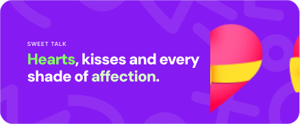
Dimensions: 438×181 (~2.4:1). rx=18. Our current card is 2.1:1 — close enough that we can adopt the new aspect without rethinking layout.
The reactions people send every day.
Onyx
Every emoji for the workday chat.
Electric
Birthdays, big wins, and reasons to celebrate.
Ultraviolet
Current — gradient + label
REACTION PACK
React Instantly
The faces and reactions people send every day.
New — solid + highlighted word
The reactions people send every day.
Data shape: replace label + title + desc with a single copy field. Use *word* markdown-ish syntax to mark the highlighted word; renderer splits on it. Keep existing fields as a fallback so we can transition without losing data.
Background: replace the Tailwind gradient bg string with { bg: string, lineColor: string, accent: string }. Expose the 3 palettes above as named presets (Onyx / Electric / Ultraviolet) plus custom.
Decorative pattern: ship one reusable LinePattern SVG. Later we can add a handful of shape-themes (waves, stars, arrows) selectable per card.
PNG render pipeline: no change. renderFeaturedCardToPng already snapshots the DOM — swap the inner component and it keeps working.